

Feb 12, 2022
React: useState vs useReducer

What is a Reducer?
Generally speaking a reducer is basically a function which takes two arguments - the current state and an action - and returns based on both arguments a new state.
A reducer can be expressed as:
const reducer = (state, action) => newState;
If you have ever used Redux library in the past then you will have first-hand experience with reducers and actions.
Some benefits of using reducers are:
- They are predictable, behave consistenly and are a nice fit for managing complex state.
- Generally they are easy to test.
- Powerful utilities like undo/redo, state persistence etc are, most of the times, easier to implement with a reducer.
Having said all that, I must point out that we shouldn't just use reducers for all of the use cases. Many times - especially for small apps and non-complex states - a reducer may do more harm than good as it may add more complexity and boilerplate code to our app.
OK, so what is useReducer?
So, React provides a hook named useReducer that we can use in order to manage our state with the help of a... reducer function.
The syntax is really simple, we just pass the reducer and the initialState and the hook returns the state and a dispatch function like this:
const [state, dispatch] = useReducer(reducer, initialState);
Then we can use the dispatch function by providing the action type and data (if needed), to update the state.
Let's take a look at an example with a counter below:
const reducer = (state, action) => {
    switch (action.type) {
        case "INCREASE_COUNTER":
            return state + 1;
        case "SET_COUNTER":
            return action.data;
        default:
            return state;
    }
}

const Component = () => {
    const [state, dispatch] = useReducer(reducer, 0); // initial counter state is 0

    // then somewhere in the app...
    return <div>
        <button onClick={()=> dispatch({type: "INCREASE_COUNTER"})}>Increase counter</button>
        <button onClick={()=> dispatch({type: "SET_COUNTER", data: 5})}>Set counter to 5</button>
    </div>
}
The actions above will cause the reducer to update the state accordingly.
Note: The returned dispatch function is memoized by default and can easily be distributed to children components, as we'll see in the tutorial below. However, any component that uses the state part returned from the useReducer will still rerender whenever that state changes. We'll not focus on the re-render parts in this article. We'll have other tutorials in the future that will talk just about how we can limit re-renders in an application. 👍
Why all this...?
You might be thinking, why writing all these complex reducers and using this weird dispatch function to perform some simple updates?
Well... that's a valid question, as the example with the counter above could be written in just a few lines with a useState hook:
const Component = () => {
    const [counter, setCounter] = useState(0); // initial counter state is 0

    // then somewhere in the app...
    return <div>
        <button onClick={()=> setCounter(c => c + 1)}>Increase counter</button>
        <button onClick={()=> setCounter(5)}>Set counter to 5</button>
    </div>
}
As a rule of thumb, it's generally recommended to use a useReducer when our state is heavily dependent on previous state or if we've got a really complex state. But as you saw from the previous example with the counter, it looks like using a reducer is an overkill.
Each app is different and we need to carefully analyze the requirements to decide on our implementation. Also keep in mind that there are many packages out there that handle global state or reducer-like state (like the awesome zustand) with just a few lines of code.
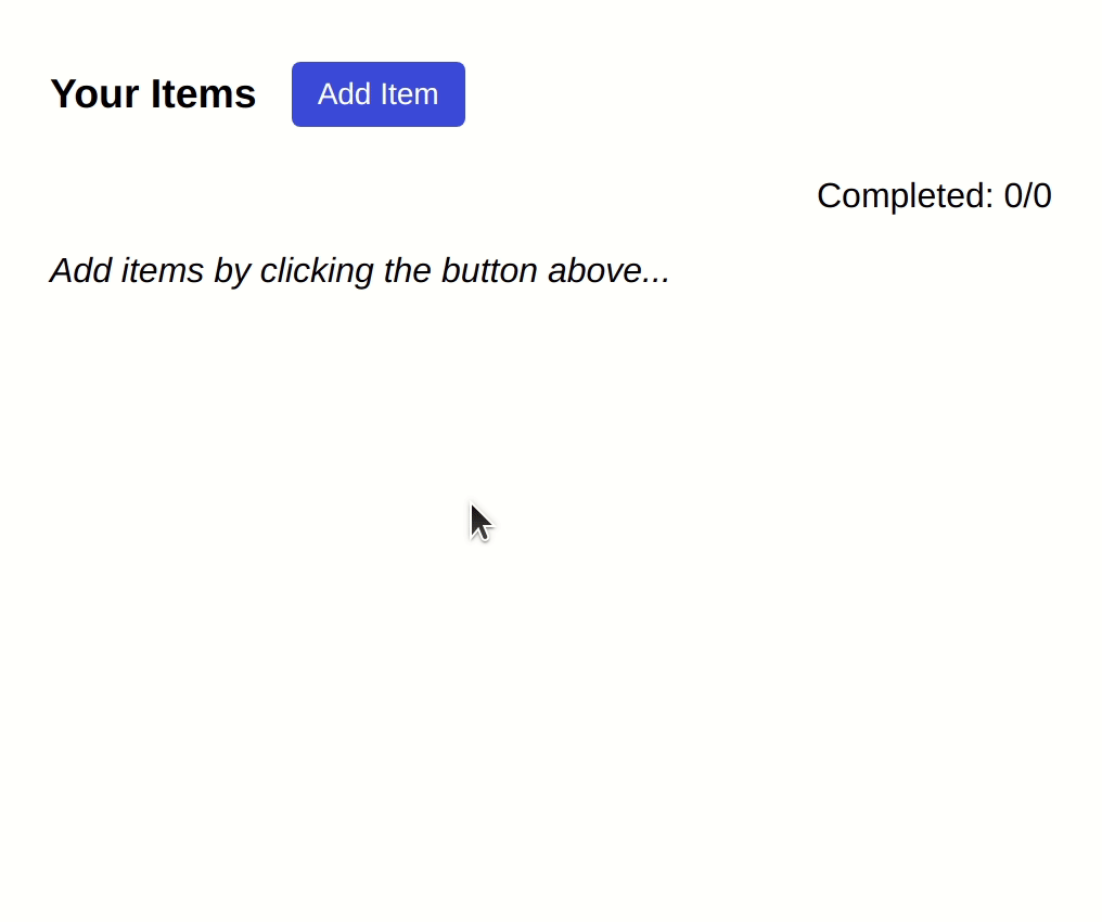
For the purpose of this tutorial, we'll focus on the differences of useState and useReducer and we'll create a simple TODO app with two implementations, one using the useState hook and one using the useReducer hook.
A Lorem ipsum TODO app
Our final app will be as shown in the GIF below and will provide the user with the ability of adding some random lorem ipsum sentences and then marking them as completed.
Implementation 1: Using a useState hook
In our first implementation we are going to use a useState hook. The code can be found here: https://codesandbox.io/s/lorem-ipsum-app-with-usestate-w60el
We created 4 files for this solution:
App.tsx: The app's starting point where theuseItemsis called.useItems.ts: The hook which internally usesuseStatethat handles the state of the items (adding an item, marking as completed etc).Actions.tsx: A component that renders the buttons "Add item" and "Mark all completed".Items.tsx: The component that actually renders the sentences inside boxes.
Let's take a look at the useItems custom hook:
// useItems.ts
import { useState, useCallback } from "react";

export type ItemType = {
  text: string;
  completed?: boolean;
};

const useItems = () => {
  const [items, setItems] = useState<ItemType[]>([]);

  const addItem = useCallback(
    (item: Pick<ItemType, "text">) =>
      setItems((prevItems) => [item, ...prevItems]),
    []
  );

  const setItemCompleted = useCallback(
    (itemIndex: number, completed: boolean) =>
      setItems((prevItems) =>
        prevItems.map((item, i) =>
          i === itemIndex ? { ...item, completed } : item
        )
      ),
    []
  );

  const toggleAllItemsCompleted = () => {
    const areAllCompleted =
      items.length > 0 &&
      items.filter(({ completed }) => !completed).length === 0;
    setItems((prevItems) =>
        prevItems.map((item) => ({ ...item, completed: !areAllCompleted }));
    );
  };

  return {
    items,
    addItem,
    setItemCompleted,
    toggleAllItemsCompleted
  };
};

export default useItems;
The useItems hook returns 4 things:
- The
itemsarray that is actually an array of objects with each object representing an item. - The
addItemfunction which will be used in order to add items to the array. - The
setItemCompletedfunction which will be used in order to set an item as completed or not completed. - The
toggleAllItemsCompletedfunction which toggles all the items to a completed (or not completed) state.
The App component (App.tsx) calls the useItems hook and distribute the appropriate props to its children components as shown below.
You don't need to pay attention to the styling, just focus on the functionality of the code.
// App.tsx
import useItems from "./use-items";
import Items from "./Items";
import styled from "styled-components";
import Actions from "./Actions";

const AppContainer = styled("div")`
  font-family: sans-serif;
  margin: 16px;
`;

const TitleContainer = styled("div")`
  display: flex;
  align-items: center;
  margin-bottom: 8px;
`;

const CompletedContainer = styled("div")`
  text-align: right;
  font-weight: 500;
`;

const Empty = styled("p")`
  font-style: italic;
`;

export const App = () => {
  const {
    items,
    addItem,
    setItemCompleted,
    toggleAllItemsCompleted
  } = useItems();

  const totalCompleted =
    items.filter(({ completed }) => completed)?.length ?? 0;

  return (
    <AppContainer>
      <TitleContainer>
        <h3>Your Items</h3>
        <Actions
          totalItems={items.length}
          addItem={addItem}
          toggleAllItemsCompleted={toggleAllItemsCompleted}
        />
      </TitleContainer>
      <CompletedContainer>
        Completed: {totalCompleted}/{items.length}
      </CompletedContainer>
      {items.length === 0 ? (
        <Empty>Add items by clicking the button above...</Empty>
      ) : (
        <Items items={items} setItemCompleted={setItemCompleted} />
      )}
    </AppContainer>
  );
}
The Actions (Actions.tsx) and Items (Items.tsx) components utilize the passed props in order to implement onClick actions and/or render the actual items as seen below:
// Actions.tsx
import styled from "styled-components";
import { ItemType } from "./use-items";
import { LoremIpsum } from "lorem-ipsum";

const lorem = new LoremIpsum({
  wordsPerSentence: {
    max: 6,
    min: 2
  }
});

type Props = {
  totalItems: number;
  addItem: (item: Pick<ItemType, "text">) => void;
  toggleAllItemsCompleted: () => void;
};

const Container = styled("div")`
  display: flex;
  flex-wrap: wrap;
  align-items: center;
  margin: 0px 16px;
`;

const Button = styled("button")`
  border-radius: 4px;
  border: none;
  font-size: 14px;
  height: 30px;
  background-color: #3453e5;
  color: white;
  padding: 0px 12px;
  margin-right: 8px;
  cursor: pointer;

  :active {
    opacity: 0.9;
    transform: scale(1.05);
  }

  &.outlined {
    border: 1px solid #3453e5;
    background: none;
    color: #3453e5;
  }
`;

const Actions = (props: Props) => {
  const { totalItems, addItem, toggleAllItemsCompleted } = props;

  return (
    <Container>
      <Button
        onClick={() =>
          addItem({
            text: lorem.generateWords()
          })
        }
      >
        Add Item
      </Button>
      {totalItems > 1 && (
        <Button className="outlined" onClick={() => toggleAllItemsCompleted()}>
          Toggle All
        </Button>
      )}
    </Container>
  );
};

export default Actions;
// Items.tsx
import { ItemType } from "./use-items";
import styled from "styled-components";
type Props = {
items: ItemType[];
setItemCompleted: (itemIndex: number, completed: boolean) => void;
};
const Container = styled("div")`
display: flex;
flex-wrap: wrap;
`;
const Item = styled("div")`
margin: 8px;
padding: 8px;
border: 1px solid #a7a7a7;
border-radius: 8px;
cursor: pointer;
color: #001a3a;
font-size: 18px;
text-transform: capitalize;
&:hover {
box-shadow: 0px 0px 3px 1px #b9b9b9;
}
&.completed {
opacity: 0.75;
text-decoration: line-through;
color: #9f9f9f;
}
`;
const Items = (props: Props) => {
const { items, setItemCompleted } = props;
return (
<Container>
{items.map(({ text, completed }, i) => (
<Item
key={i}
className={completed ? "completed" : ""}
onClick={() => setItemCompleted(i, !completed)}
>
{text}
</Item>
))}
</Container>
);
};
export default Items;So the useState solution definitely works. We've got a custom hook that is responsible for managing the state and also exposes the functions addItem, setItemCompleted and toggleAllItemsCompleted that components deeper down in the tree can use to perform actions.
Implementation 2: Using a useReducer hook
For our second implementation we are going to use a useReducer hook. The code can be found here: https://codesandbox.io/s/lorem-ipsum-app-with-usereducer-h1c2s
Obviously the styling part and structure of the app is exactly the same with the previous implementation, that's why we will omit any code related to styling and focus only on the important parts.
The key change is how the useItems hook is implemented (using a useReducer hook) and how the components utilize the dispatch function in order to perform the actions.
Let's take a look at the useItems hook. We construct the reducer function by providing all the cases (actions) our app will have: ADD_ITEM, SET_ITEM_COMPLETED and TOGGLE_ALL_ITEMS_COMPLETED.
Finally the useReducer hook returns two things - the actual state (which contains the items) and a dispatch function.
// useItems.ts
import { useReducer } from "react";

export type ItemType = {
  text: string;
  completed?: boolean;
};

type State = {
  items: ItemType[];
};

export type Action =
  | {
      type: "ADD_ITEM";
      data: {
        item: Pick<ItemType, "text">;
      };
    }
  | {
      type: "SET_ITEM_COMPLETED";
      data: { itemIndex: number; completed: boolean };
    }
  | { type: "TOGGLE_ALL_ITEMS_COMPLETED" };

const reducer = (state: State, action: Action): State => {
  switch (action.type) {
    case "ADD_ITEM": {
      const { item } = action?.data;
      return {
        ...state,
        items: [item, ...state.items]
      };
    }

    case "SET_ITEM_COMPLETED":
      const { itemIndex, completed } = action?.data;
      return {
        ...state,
        items: state?.items.map((item, i) =>
          i === itemIndex ? { ...item, completed } : item
        )
      };

    case "TOGGLE_ALL_ITEMS_COMPLETED": {
      const currentItems = state?.items ?? [];
      const areAllCompleted =
        currentItems.length > 0 &&
        currentItems.filter(({ completed }) => !completed).length === 0;
      return {
        ...state,
        items: currentItems.map((item) => ({
          ...item,
          completed: !areAllCompleted
        }))
      };
    }

    default:
      throw new Error();
  }
};

const useItems = () => {
  const [state, dispatch] = useReducer(reducer, { items: [] });

  return {
    state,
    dispatch
  };
};

export default useItems;
The App component will just have to distribute the dispatch function to its child components, instead of passing down separate functions like in the previous example.
// App.tsx
import useItems from "./use-items";
import Items from "./Items";
import Actions from "./Actions";
import styled from "styled-components";

/*
...
styled components here
...
*/

export default function App() {
  const { state, dispatch } = useItems();
  const { items } = state;

  const totalCompleted =
    items.filter(({ completed }) => completed)?.length ?? 0;

  return (
    <AppContainer>
      <TitleContainer>
        <h3>Your Items</h3>
        <Actions totalItems={items.length} dispatch={dispatch} />
      </TitleContainer>
      <CompletedContainer>
        Completed: {totalCompleted}/{items.length}
      </CompletedContainer>
      {items.length === 0 ? (
        <Empty>Add items by clicking the button above...</Empty>
      ) : (
        <Items items={items} dispatch={dispatch} />
      )}
    </AppContainer>
  );
}
The Actions and Items components only need the dispatch function to perform things.
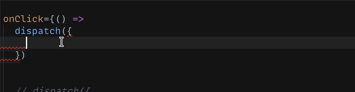
Also TypeScript will provide us with nice autocompletes for the dispatch function due to the fact that the type of the function is React.Dispatch<Action>. You can see at the GIF below that we can easily figure out how we can use the dispatch function from the types that IDE provides through TS.
// Actions.tsx
import styled from "styled-components";
import { Action } from "./use-items";
import { LoremIpsum } from "lorem-ipsum";

const lorem = new LoremIpsum({
  wordsPerSentence: {
    max: 6,
    min: 2
  }
});

type Props = {
  totalItems: number;
  dispatch: React.Dispatch<Action>;
};

/*
...
styled components here
...
*/

const Actions = (props: Props) => {
  const { totalItems, dispatch } = props;

  return (
    <Container>
      <Button
        onClick={() =>
          dispatch({
            type: "ADD_ITEM",
            data: {
              item: {
                text: lorem.generateWords()
              }
            }
          })
        }
      >
        Add Item
      </Button>
      {totalItems > 1 && (
        <Button
          className="outlined"
          onClick={() => dispatch({ type: "TOGGLE_ALL_ITEMS_COMPLETED" })}
        >
          Toggle All
        </Button>
      )}
    </Container>
  );
};

export default Actions;
// Items.tsx
import { Action, ItemType } from "./use-items";
import styled from "styled-components";
type Props = {
items: ItemType[];
dispatch: React.Dispatch<Action>;
};
/*
...
styled components here
...
*/
const Items = (props: Props) => {
const { items, dispatch } = props;
return (
<Container>
{items.map(({ text, completed }, i) => (
<Item
key={i}
className={completed ? "completed" : ""}
onClick={() =>
dispatch({
type: "SET_ITEM_COMPLETED",
data: { itemIndex: i, completed: !completed }
})
}
>
{text}
</Item>
))}
</Container>
);
};
export default Items;Comparing the two implementations
| useState | useReducer | |
|---|---|---|
| 1 | Updates state with setState |
Updates state with dispatch function |
| 2 | Passes down all the setState custom helper functions addItem, setItemCompleted, toggleAllItemsCompleted |
Passes down just the dispatch function |
| 3 | Needs to wrap functions in useCallback (if we want to memoize them) |
dispatch function is already memoized |
| 4 | Harder to test but easier to write | Easier to test but harder to write; one can just test the reducer function that is exposed |
In my opinion, I think that the useReducer implementation is more suitable for this specific application. We can see that the app is more scalable with the reducer as we can easily just add new actions and then components will just need to use the dispatch function to update the state. It really provides more predictability and scalability to our code.
With the useState implementation we would have to add more custom functions (naming them in an appropriate way - and we know that naming things is hard in computer science 🙃), and then pass those functions down to our components to use.
Furthermore, due to the fact that the reducer is just a standalone function, we can easily test it independently from the other parts of the application.
Having said all that, I must point out that there are many ways and many implementations that could solve this problem. One could argue that using context is better, one could just use a npm library that provides global-state (or reducer-like state) with a just a few lines of code. In this tutorial I wanted to focus on just the core "native" libraries of React (useState and useReducer). We'll create another tutorial in the future where we will analyze how we can achieve things with React context and other libraries.
The End...
Thanks for reading this article and remember... independently of what kind of tools you'll use to solve any problem, in the end the code must be readable and the implementation scalable, maintanable and as little complex as possible.
Catch you later! 🙂
Newsletter
Subscribe to my mailing list
Subscribe to get my latest content by email. I won't send you spam, I promise. Unsubscribe at any time.